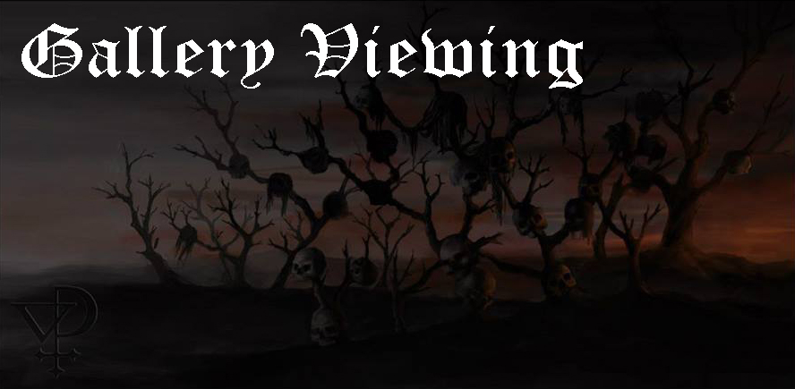
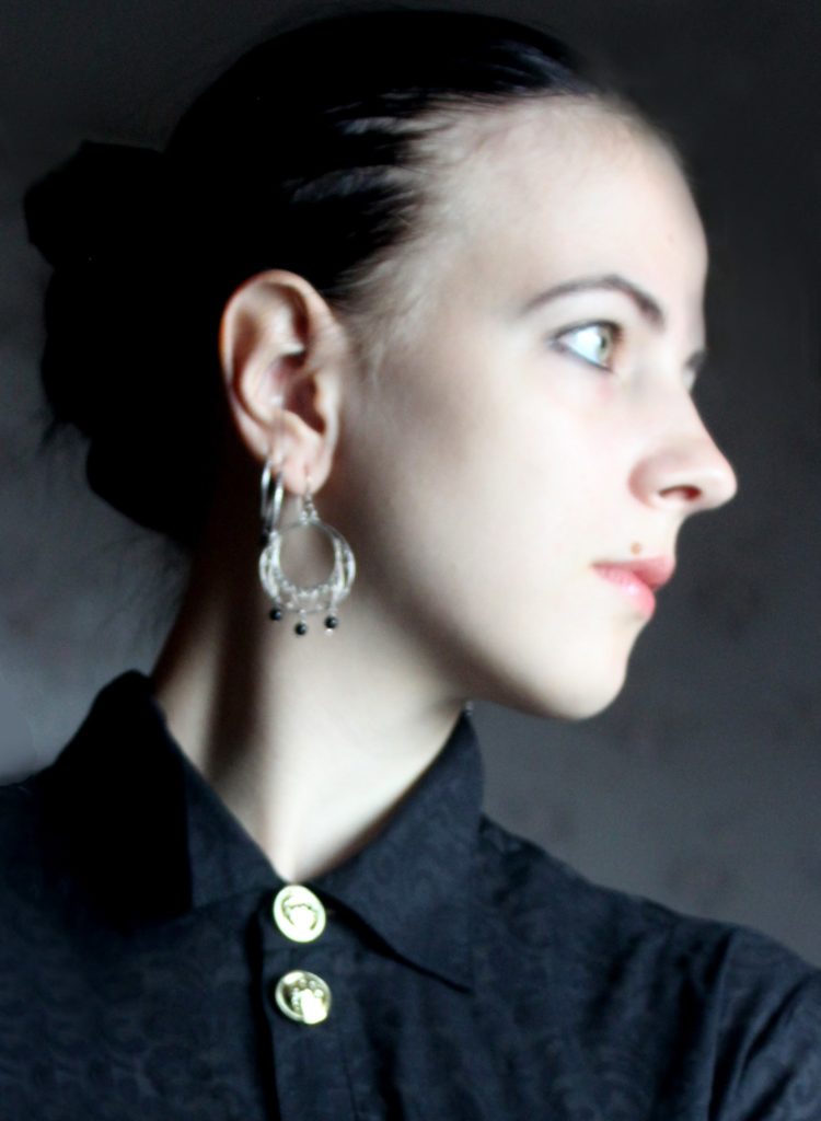
Artist Unmasked: Viktoria Polikarpova of Visionis Phosphorescent
As some of you know, I’ve been developing new ideas behind the scenes for the future of Deaf Sparrow, one of which was the plan to highlight different underground artists, including a showcase of their most recent art, like a digital gallery viewing. The reason behind this is I noticed a serious lack of support for so many of these great artists; review sites that give no mention of who they are, or even promo sheets and emails completely lacking any information. So with this new series I’ll be highlighting such artists. The main difficulty in starting this project was finding a suitable program to use to display their art that would be simple and easy to use, and I did, after much experimentation. So now, without further ado, or me wasting more time, I give to you our first artist feature of Viktoria Polikarpova, founder of art-studio Visionis Phosphorescent. This article has retained the first-person as written by Viktoria with only minor edits, featuring some of her earlier art, music from bands she’s worked with, and then finally a link at the bottom that will lead you to her gallery show.
 My artistic path began quite long ago. From early childhood I always was better at drawing than other kids of my age. When I went to the primary school, I began to draw more extensively. I was drawing non-stop, every day, at school and at home, in the morning and in the evening – possibly every moment when I had some free time. In my drawings I was trying to reflect my inner world which revealed fantastic creatures and landscapes of the magical worlds which I was creating with my imagination. I was living in these ‘realities’. The outer, ‘real’ world seemed quite like an illusion to me.
When my parents noticed my enthusiasm towards drawing, they decided to change my school from a simple one to an artistic one. The new school of mine was the most important factor in my evolution as an artist. It was even not a school, but a college – College of Music and Theatre Art under the patronage of the famous opera singer Galina Vishnevskaya. It had four faculties with different creative disciplines: classical music, opera, ballet and art which altogether were united in real theatrical activity. Daily we had our simple disciplines as mathematics, chemistry, history etc, and classes of art such as academic drawing, painting, sculpture, history of art, history of costumes and so on. Students who were studying under the art faculty were responsible for making decorations and costumes for the plays. And here, as you can guess, the aspect of atmosphere was especially important.
The creation of artistic atmosphere became my main subject. In school times I was trying to draw extra and these drawings were becoming darker and darker in theme. It was because of the influence of extreme metal (black metal mostly), Gothic rock and dark ambient which I began to listen at that time.
 After I finished school, I entered Moscow Architectural Institute. There I received excellent training in classical academic drawing and black and white graphic techniques. At the same time I got a little bit into digital art (you can see my experiments with the ‘Black Rock’ and a ‘Snow Landscape After the Thunderstorm’). In the latter I tried to apply all my painting skills too. After some years, my art project ‘Visionis Phosphorescent’ was born as a conduit to channel esotericism via the mode of art.
I am using all the techniques which I studied in my institute in my black and white artwork. For example, my stippling is not just stippling. I use liquid ink mixed with water to get softer shades. It makes stippling more detailed and rich of shadows. You can see it in my cover art of Cirith Gorgor‘s latest EP Bi Den Dode Hant. Here I needed to make a feeling of a mysterious night landscape with the ‘Bokkenriders’- legendary goat riders of XVIII century Dutch folklore. Using this technique of ink mixed with water I made extra volume of the clouds behind the riders. It could have been impossible to achieve it with simple stippling.[Editor: Please note artwork Viktoria discusses here and elsewhere that is not linked is in the gallery viewing on the next page.]
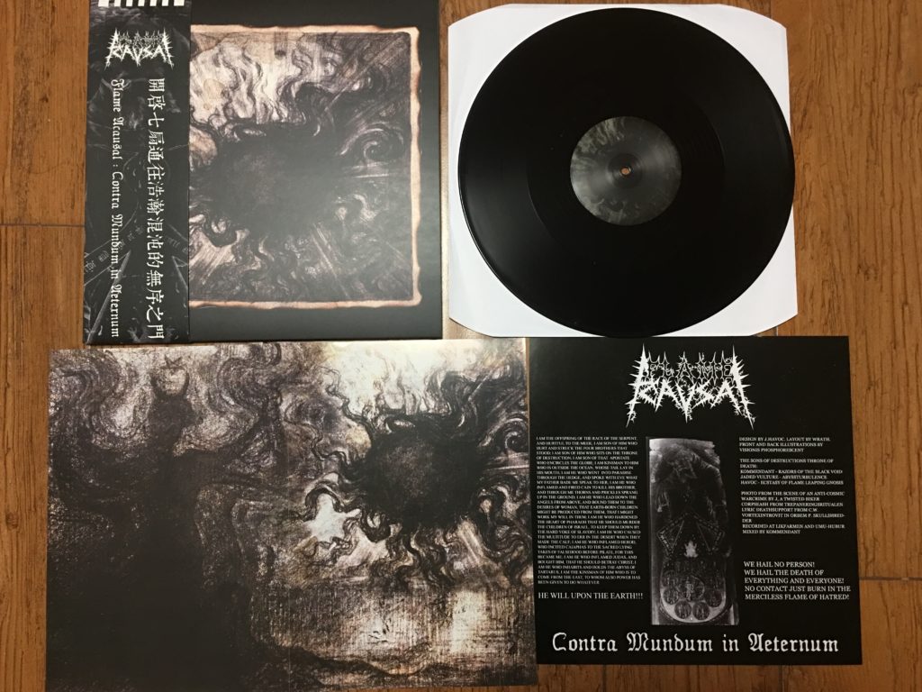
Sometimes I like to make quick intuitive drawings with a simple artistic pencil, for example ‘Black Sun’ which became a cover art for Flame Acausal‘s debut LP Contra Mundum in Aeternum. This was my first ‘paid’ artwork in the metal underground and there is an interesting story behind it. At that time I liked to make small pencil arts to put out my emotions. The guys from the band chose ‘Black Sun’ and ‘Charms (a similar piece with a figure). They suddenly found out that if the art was put together they are connected by the sun’s rays! This phenomenon was used in the design of the gatefold vinyl. You can see that arts are merged together. It was not done deliberately.
My skills in drawing and inking you can also see by the logos I’ve made. I’m very proud of the logo which I made for my husband’s metal project called Violent Upheaval. This logo is composed of weapon details such as bullets, knives and so on. To make this logo I took real, technical army drawings as the references and made my own drawing in which everything was measured to a millimeter. After that the logo was inked and scanned without much digital manipulation.
Another logo which I like a lot is a logo for a young Ukraine band called Chod. Chod is a mystical tradition in Tibetan Buddhism based on idea of cutting out the Ego and different meditations upon death. That’s why I composed the alphabets from the bones in a “Tibetan” style. In one of the first sketches some traditional Tibetan implements were added to the letters but the band decided to go with a simpler version.
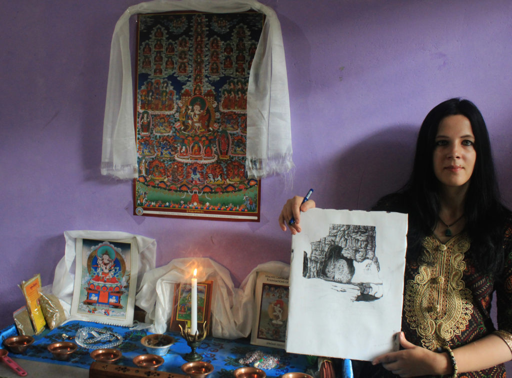
 The main subjects which I like to highlight in my arts are dark impressionism (when I simply reflect some feeling, atmosphere of the place, – Black Rock, Mountain Landscape after the Storm, Black Sun), occult motives of western magic and mysticism (as you can see at Bitter Sea of Binah, Black Sulphur and Aqua Permanens) and, finally, Eastern mysticism. The latter is the most closest to my heart. Here you can see Yogini, Chod Practitioner, Prayer Flags, The Great Churning etc. In fact I have recently started studying the ancient art of Tibetan thangka painting in India.
Whatever I draw I’m trying to reflect a feeling, an aura, an atmosphere, – so that a viewer can get a deeper feeling, touch a different realm if I may say so. I believe that this is a purpose of the art in general – to get the viewer out of his daily routine and banalities of life. I respect all the artists of all the times who had a skill to do so: impressionists, surrealists and symbolists. I admire and seek influence from traditional mystical art where sacred images play a similar role: they get the viewer out of his daily life and help him to connect with metaphysical levels of existence.
Now that you know a little about Viktoria and her work, let’s move on to the gallery showing, where you’ll get a taste of her most recent work, and her thoughts on it. Click the image below to move on to the next page.